Originally Published on Rent.com. By Charlsie Niemiec.
Pick a shade, any shade — the popular paint colors for 2022 offer something for any aesthetic!
You've probably seen them by now, the many popular paint colors for 2022. From Pantone's Color of the Year Very Peri to Benjamin Moore's October Mist, the shades of 2022 offer something for everyone's aesthetic. Whether you live for bold and moody hues or you prefer lighter or softer shades, the popular paint colors for 2022 truly run the gamut — which is why we talked with interior designers and paint experts about the best ways to style your apartment using these trendy colors.
Here's what our experts had to say about tying 2022's chicest shades into your current living space.
1. Open your arms and embrace change
"People are craving change in just about everything this year. One result of this need for change is the use of more color in interior design, which is a departure from the all-white design schemes that have dominated the last decade," says Aaron Hall, owner of Painter1.com. "Four of the biggest paint companies (Sherwin Williams, Pantone, Behr & Delux and Benjamin Moore) all chose a 2022 Color of the Year in either a blue or green tone. These muted variations evoke the ultimate feeling of serenity, which is exactly what we all need right now!
"Also, color tones that complement these muted blue and green shades are creamy whites, warm-gray whites, natural wood tones and light or deep hues of gold, orange and peach. Try accent pieces in bold green, mustard yellow, royal blue or poppy red. Often, a rug, a favorite piece of art or patterned upholstery can be a great source of inspiration for beautiful interior color schemes."
2. Make a statement
"2022 is the year of making statements! Show off your personal growth by expressing your boldness with an ocean of blues, greens and moody black hues," says Autumn Rose Interiors. "You can start by adding a pop of dark accents to bookshelves and table-scapes. Once you're ready, try long, dark, luscious drapes to provide a beautiful contrast to neutral light walls or take it to the next level with a surprise room — like a dark, moody powder bath or bedroom."
3. Paint the ceiling
“Warmed up neutrals are a great way to incorporate trends but in a way that's timeless, easy and renter-friendly because it'll be easy to paint over if you move out. I love creamier shades of white on the walls paired with bright white trim and moldings," says Kaitlin Madden. “Moody hues are big right now, especially blues and greens. For a look that's very 2022, paint both walls and the ceiling (check with your landlord first!). If that's not an option, try it with furniture. Paint a kitchen cart your favorite shade and use it as an island, for example."
4. Be bold
“We love using bold colors, such as the Van Deusen Blue from Benjamin Moore (one of Benjamin Moore's most popular blues), to create vibrant accent walls in a property, especially in dining room areas to add a dramatic effect and visual interest," says Pavel Khaykin from Pavel Buys Houses. "When paired with a neutral contrasting wall paint color, such as Benjamin Moore's Classic Gray, the combination brings great energy to a room and goes beautifully with wood floors, especially white furnishings and fixtures. A small cosmetic update like this is fairly easy and quick to accomplish and can make your property truly stand out."
5. Add a little pizazz with framed art
“Chameleon colors like Sherwin Williams Sea Salt or Benjamin Moore's October Mist allow renters to add relatively neutral colors to their space to make it their own," says Port City Paint in Wilmington, NC. "When paired with shades of linen or gray — either paint or furniture — your home becomes a personal reflection of you! Add a pop of color with yellow, blue or coral throw pillows or framed art to add a little pizazz. A home office or workspace painted with a complementary color like Benjamin Moore Crisp Linen gives brightness and a sense of calm to the space. Accent a spare bedroom wall, half bath or a wall in your office space with a pop of periwinkle blue to bring the palate full circle."
6. Frame your favorite wallpaper
"A really fun way to bring style and design into a rental home is framed wallpaper! It is less expensive than wallpapering an entire wall," says stylist and designer Becky McFarland Cox. "The key is coordinating the wallpaper with a contemporary paint color like Benjamin Moore's October Mist. Framing wallpaper gives a huge visual impact and the best part is you can take it with you when you move!"
7. Get dramatic with warm neutrals and dramatic depth
“When people hear terracotta they instinctively see an image of typical terracotta colored tiles which naturally leads to envisioning a southwest aesthetic. However, terracotta is so much more than that!" says the Crimson Design Group in Columbus, OH. "Start with a terracotta-colored base piece — think large pieces of furniture like a couch or cabinet — and use an assortment of colors in the terracotta family like oranges and reds for your accent pieces. Your space will become much richer and a lot more interesting!"
"Bringing in aquas or emeralds can be as simple as incorporating live greenery or accessories like throw pillows or vases into a more subdued space. It adds life and vibrancy!"
"Additionally, vibrant and earthy shades are an excellent way to incorporate color into your space, especially through our personal favorite, gallery walls! You can also use baskets, frames or plates to bring a vibrant earthiness to your space."
"People are often scared of black paint but they don't need to be — there is a reason it is known as the chicest color. It can be used to create a stunning moody romantic space that encourages intimate conversation. Use different shades of black to layer as the background with warm neutrals mixed in for a modern space. It can also be the perfect contrasting trim to white walls!"
8. Look to your lighting
"To get the most out of your moody hues, we recommend leaning into different layers of lighting. It's hard to feel “the vibe" that a room full of aubergines and forest greens creates when all you have is super-bright overhead light fixtures," says Kind Interior Design. "Add lamps for task and accent lighting in various zones around your space. Replace the bulbs in your overhead (ambient) light fixtures with smart bulbs to be able to dim your lights if your home isn't wired for it. Dark and moody hues like Benjamins Moores's Backwoods become rich and luxurious when adequately (but softly) lit."
9. Opt for complementary shades when playing with paint colors for 2022
"A soft and earthy shade easily harmonizes with your floors, furniture and appliances," says Sandpiper Listings. "Benjamin Moore's October Mist is light enough to make rooms appear larger and it pairs perfectly with accessories and fixtures. Its calming tone is ideal for walls, doors or cabinetry. This sophisticated and modern color is complementary to blues, purples and darker shades of green."
10. Play with greige undertones
“Evergreen Fog is Sherwin Williams' 2022 color of the year for good reason! This incredibly elegant, cool paint color can be used in bedrooms, bathrooms, accent walls or even cabinets to instantly give your home a more sophisticated look," says Brandon Griffin, founder and owner of Triangle Pro Painting. "For a bold contrast, try pairing Evergreen Fog with Sherwin Williams Alabaster, as they both share the same greige undertone."
11. Make your walls the main feature
"Our color palette typically consists of a white, a neutral and a dark pop. Oftentimes, smaller spaces and rental walls get neglected but we've found that by adding a punch color, not only grounds a room but can make it feel bigger and taller," says Terra Sol Design Co. "Here are our top choices for giving those walls the feature they deserve!"
- Sherwin Williams Modern Grey (7632) - A perfect mix of grey and beige
- Magnolia Home Fine Black - A grey/blue/black
- Sherwin Williams Iron Ore (7069) - A charcoal/navy/black
"Additionally, use light or white decor and wood furnishings against a dark wall for the ultimate wow factor."
12. Amplify your furniture style
Joan Inglis, a model home merchandiser, interior designer, and master staging professional shared three ways to incorporate paint colors for 2022 into your space:
"Sherwin Williams Evergreen Fog is a muted green shade, it works well with terracotta and dark green colors. Since most apartment walls are initially painted white or off-white, Evergreen Fog can be a good choice as a soothing focal point wall behind the bed or in a bathroom." Look for Evergreen Fog in upholstery, pillows and artwork. Bring in deeper companion tones such as Sherwin Williams "Rookwood Sash Green" and "Rookwood Terra Cotta" in textiles, art and accessories. Both deep colors will function as attention-grabbers and will intesify the appeal of your décor."
"Benjamin Moore October Mist makes me envision the apartment-dweller sipping a cup of green tea on their balcony while enjoying the cooler fall temperature. Consider using the very pale sage green color of October Mist to paint outdoor furniture, pottery and vintage accent furniture pieces. Bring in medium and darker tones in compatible sandy tan and caramel-like Benjamin Moore "Sandy Brown" and "Etruscan." Both will pair well with October Mist in solids and patterns mixed with white, off-white and black."
"Blacks, charcoals, dark browns and navy work well in design provided you have enough white or off-white to create balance. Dark rooms can negatively affect your emotions. So you don't want to surround yourself with black walls, black trim, black draperies and very little natural light. Darkest colors work best in rooms flooded with light, like a sunroom, or used as an accent surrounding bay windows. Anywhere fixtures and surfaces are solid white, black and dark colors can work well."
13. Play with dimension
"If you are looking to charm with a touch of elegance and yet still be trendy, aquas and greens are two jeweled hues that will give you exactly what you are looking for," says Justin Brown, owner of J Brown Painting, "Brighten up your homes to the soothing gentleness of the color aqua or if you are looking to add a rich dimension to your space, emerald green is your go-to. The versatility of these colors is guaranteed to make a statement."
Get to painting!
With so many popular paint colors for 2022, the possibilities are endless! What are you waiting for? Head to the store for paint, paint rollers, paintbrushes, painter's tape and drop cloths — the necessities — and get to work!
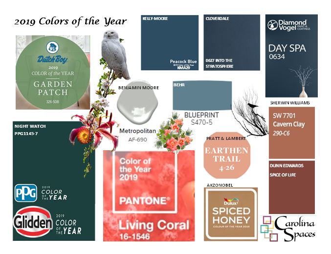
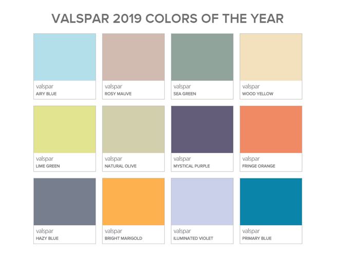
Valspar’s 2019 selection of a dozen colors ranging from the tried-and-true neutral to pastels and jewel tones gives you a pallet to complement and contrast.
In all things paint - remember that light has a great effect on the color you’ll see. Avoid mistakes by consulting a design professional before making your color selection. Carolina Spaces Furniture & Design provides professional color consultations and offers discounts on your paint purchase. Contact us at 1-855-SPACES-5.
View this post at blogspot.com.
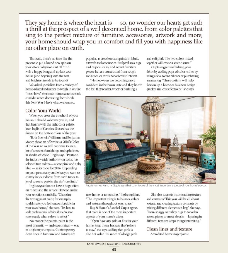
Joan Inglis, leading Accredited Home Staging Professional Master® in North Carolina, was featured in the January 2016 issue of Lake Norman Currents Magazine. Joan provided her expertise to Decor Trends for 2016 and Beyond where she discussed must-have elements home owners should consider when decorating their home this year.
Joan Inglis has been featured dozens of times on TV, online, and in print. She has won numerous state, regional, and local awards since forming her company Carolina Spaces in 2004. Joan reigns as the Charlotte Region's leading expert in Home Staging, Model Home Merchandising and Interior Design. Joan provides professional presentations and speaking engagements to enhance educational programs for Realtors®, homebuilders and investors. Contact her at www.CarolinaSpaces.com 1-855-SPACES-5.